


使用 TensorBoard 視覺化模型、資料和訓練
創建於:2019 年 8 月 8 日 | 最後更新於:2022 年 10 月 18 日 | 最後驗證於:2024 年 11 月 5 日
在 60 分鐘閃電戰 教程中,我們展示瞭如何載入資料、如何透過一個定義為 nn.Module 子類的模型來處理資料、如何在訓練資料上訓練模型以及如何在測試資料上測試模型。為了瞭解訓練進展,我們在模型訓練時打印出一些統計資訊。然而,我們可以做得更好:PyTorch 集成了 TensorBoard,這是一個專門用於視覺化神經網路訓練結果的工具。本教程將介紹 TensorBoard 的一些功能,使用 Fashion-MNIST 資料集,該資料集可以使用 torchvision.datasets 載入到 PyTorch 中。
在本教程中,我們將學習如何
讀取資料並進行適當的變換 (與之前的教程幾乎相同)。
設定 TensorBoard。
向 TensorBoard 寫入資料。
使用 TensorBoard 檢查模型架構。
使用 TensorBoard 建立我們在上一個教程中建立的視覺化的互動式版本,並減少程式碼量
具體來說,關於第 5 點,我們將看到
幾種檢查訓練資料的方法
如何跟蹤模型在訓練過程中的效能
模型訓練完成後如何評估其效能。
我們將從與 CIFAR-10 教程 中類似的樣板程式碼開始
# imports
import matplotlib.pyplot as plt
import numpy as np

import torch
import torchvision
import torchvision.transforms as transforms

import torch.nn as nn
import torch.nn.functional as F
import torch.optim as optim

# transforms
transform = transforms.Compose(
    [transforms.ToTensor(),
    transforms.Normalize((0.5,), (0.5,))])

# datasets
trainset = torchvision.datasets.FashionMNIST('./data',
    download=True,
    train=True,
    transform=transform)
testset = torchvision.datasets.FashionMNIST('./data',
    download=True,
    train=False,
    transform=transform)

# dataloaders
trainloader = torch.utils.data.DataLoader(trainset, batch_size=4,
                                        shuffle=True, num_workers=2)


testloader = torch.utils.data.DataLoader(testset, batch_size=4,
                                        shuffle=False, num_workers=2)

# constant for classes
classes = ('T-shirt/top', 'Trouser', 'Pullover', 'Dress', 'Coat',
        'Sandal', 'Shirt', 'Sneaker', 'Bag', 'Ankle Boot')

# helper function to show an image
# (used in the `plot_classes_preds` function below)
def matplotlib_imshow(img, one_channel=False):
    if one_channel:
        img = img.mean(dim=0)
    img = img / 2 + 0.5     # unnormalize
    npimg = img.numpy()
    if one_channel:
        plt.imshow(npimg, cmap="Greys")
    else:
        plt.imshow(np.transpose(npimg, (1, 2, 0)))
我們將定義與該教程類似的模型架構,只做少量修改,以考慮到影像現在是單通道而不是三通道,以及 28x28 而不是 32x32。
class Net(nn.Module):
    def __init__(self):
        super(Net, self).__init__()
        self.conv1 = nn.Conv2d(1, 6, 5)
        self.pool = nn.MaxPool2d(2, 2)
        self.conv2 = nn.Conv2d(6, 16, 5)
        self.fc1 = nn.Linear(16 * 4 * 4, 120)
        self.fc2 = nn.Linear(120, 84)
        self.fc3 = nn.Linear(84, 10)

    def forward(self, x):
        x = self.pool(F.relu(self.conv1(x)))
        x = self.pool(F.relu(self.conv2(x)))
        x = x.view(-1, 16 * 4 * 4)
        x = F.relu(self.fc1(x))
        x = F.relu(self.fc2(x))
        x = self.fc3(x)
        return x


net = Net()
我們將定義與之前相同的 optimizer 和 criterion
criterion = nn.CrossEntropyLoss()
optimizer = optim.SGD(net.parameters(), lr=0.001, momentum=0.9)
1. TensorBoard 設定
現在我們將設定 TensorBoard,從 torch.utils 匯入 tensorboard,並定義一個 SummaryWriter,這是我們向 TensorBoard 寫入資訊的關鍵物件。
from torch.utils.tensorboard import SummaryWriter

# default `log_dir` is "runs" - we'll be more specific here
writer = SummaryWriter('runs/fashion_mnist_experiment_1')
注意,僅此一行就會建立一個 runs/fashion_mnist_experiment_1 資料夾。
2. 向 TensorBoard 寫入資料
現在讓我們使用 make_grid 向 TensorBoard 寫入一張圖片 - 特別是,一個網格。
# get some random training images
dataiter = iter(trainloader)
images, labels = next(dataiter)
# create grid of images
img_grid = torchvision.utils.make_grid(images)
# show images
matplotlib_imshow(img_grid, one_channel=True)
# write to tensorboard
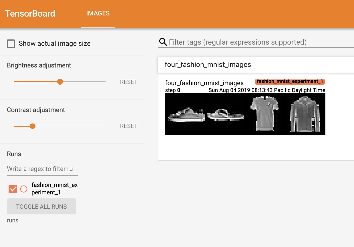
writer.add_image('four_fashion_mnist_images', img_grid)
現在執行
tensorboard --logdir=runs
從命令列執行,然後導航到 https://:6006 應該會顯示如下內容。
現在你知道如何使用 TensorBoard 了!然而,這個例子也可以在 Jupyter Notebook 中完成 - TensorBoard 真正擅長的是建立互動式視覺化。接下來我們將介紹其中一個,在本教程結束時還會介紹更多。
3. 使用 TensorBoard 檢查模型
TensorBoard 的一個優勢是它能夠視覺化複雜的模型結構。讓我們視覺化我們構建的模型。
writer.add_graph(net, images)
writer.close()
現在重新整理 TensorBoard 後,你應該會看到一個名為“Graphs”的標籤頁,看起來像這樣
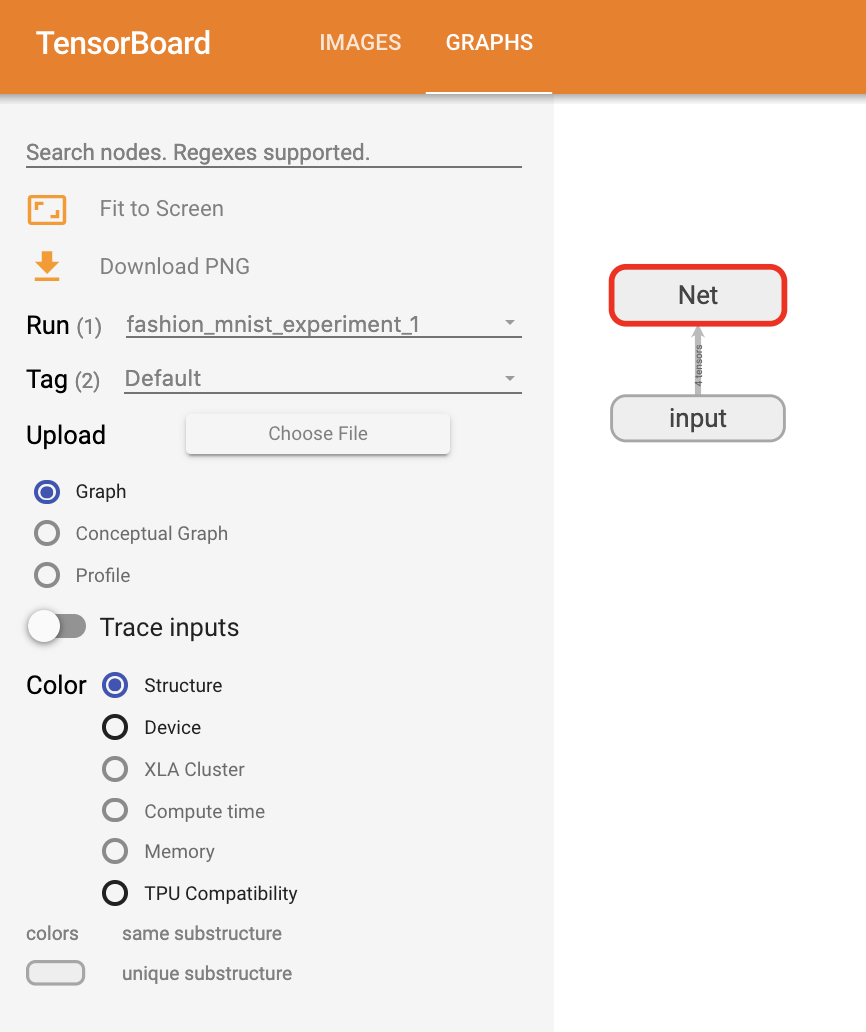
繼續雙擊“Net”以展開它,檢視構成模型的各個操作的詳細檢視。
TensorBoard 有一個非常有用的功能,可以將影像資料等高維資料視覺化到低維空間中;接下來我們將介紹這一點。
4. 向 TensorBoard 新增“Projector”
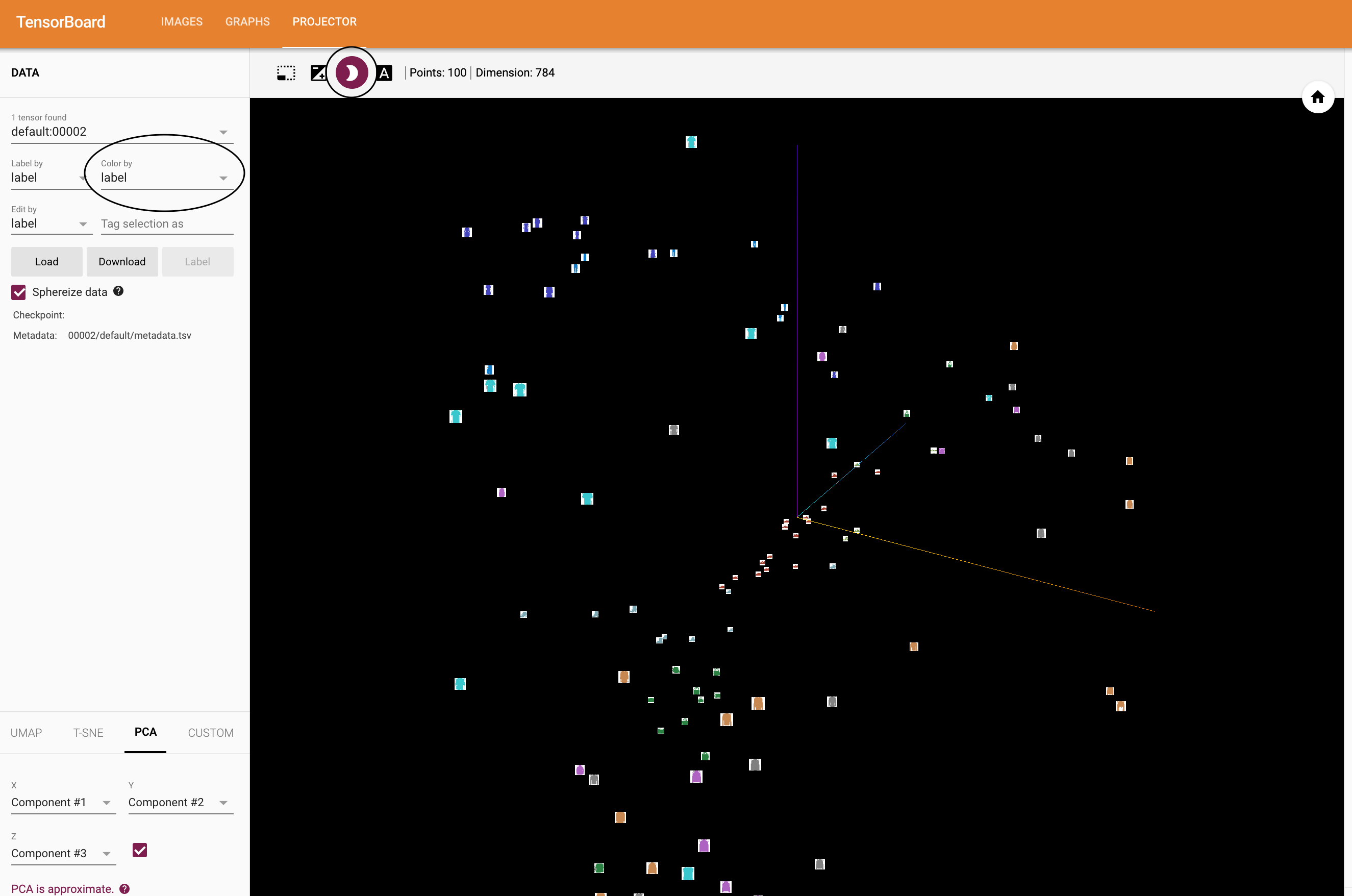
我們可以透過 add_embedding 方法視覺化高維資料在低維空間中的表示
# helper function
def select_n_random(data, labels, n=100):
    '''
    Selects n random datapoints and their corresponding labels from a dataset
    '''
    assert len(data) == len(labels)

    perm = torch.randperm(len(data))
    return data[perm][:n], labels[perm][:n]

# select random images and their target indices
images, labels = select_n_random(trainset.data, trainset.targets)

# get the class labels for each image
class_labels = [classes[lab] for lab in labels]

# log embeddings
features = images.view(-1, 28 * 28)
writer.add_embedding(features,
                    metadata=class_labels,
                    label_img=images.unsqueeze(1))
writer.close()
現在在 TensorBoard 的“Projector”標籤頁中,你可以看到這 100 張影像 - 每張都是 784 維的 - 被投影到三維空間中。此外,這是互動式的:你可以點選並拖動來旋轉三維投影。最後,提供一些使視覺化更容易檢視的技巧:在左上角選擇“color: label”,並啟用“night mode”,這將使影像更容易看到,因為它們的背景是白色。
現在我們已經徹底檢查了資料,接下來讓我們展示 TensorBoard 如何使模型訓練和評估的跟蹤更加清晰,從訓練開始。
5. 使用 TensorBoard 跟蹤模型訓練
在上一個例子中,我們只是簡單地每 2000 次迭代列印模型的執行損失。現在,我們將轉而將執行損失記錄到 TensorBoard 中,並透過 plot_classes_preds 函式檢視模型的預測。
# helper functions

def images_to_probs(net, images):
    '''
    Generates predictions and corresponding probabilities from a trained
    network and a list of images
    '''
    output = net(images)
    # convert output probabilities to predicted class
    _, preds_tensor = torch.max(output, 1)
    preds = np.squeeze(preds_tensor.numpy())
    return preds, [F.softmax(el, dim=0)[i].item() for i, el in zip(preds, output)]


def plot_classes_preds(net, images, labels):
    '''
    Generates matplotlib Figure using a trained network, along with images
    and labels from a batch, that shows the network's top prediction along
    with its probability, alongside the actual label, coloring this
    information based on whether the prediction was correct or not.
    Uses the "images_to_probs" function.
    '''
    preds, probs = images_to_probs(net, images)
    # plot the images in the batch, along with predicted and true labels
    fig = plt.figure(figsize=(12, 48))
    for idx in np.arange(4):
        ax = fig.add_subplot(1, 4, idx+1, xticks=[], yticks=[])
        matplotlib_imshow(images[idx], one_channel=True)
        ax.set_title("{0}, {1:.1f}%\n(label: {2})".format(
            classes[preds[idx]],
            probs[idx] * 100.0,
            classes[labels[idx]]),
                    color=("green" if preds[idx]==labels[idx].item() else "red"))
    return fig
最後,讓我們使用之前教程中的相同模型訓練程式碼來訓練模型,但每 1000 個批次將結果寫入 TensorBoard,而不是列印到控制檯;這是透過使用 add_scalar 函式完成的。
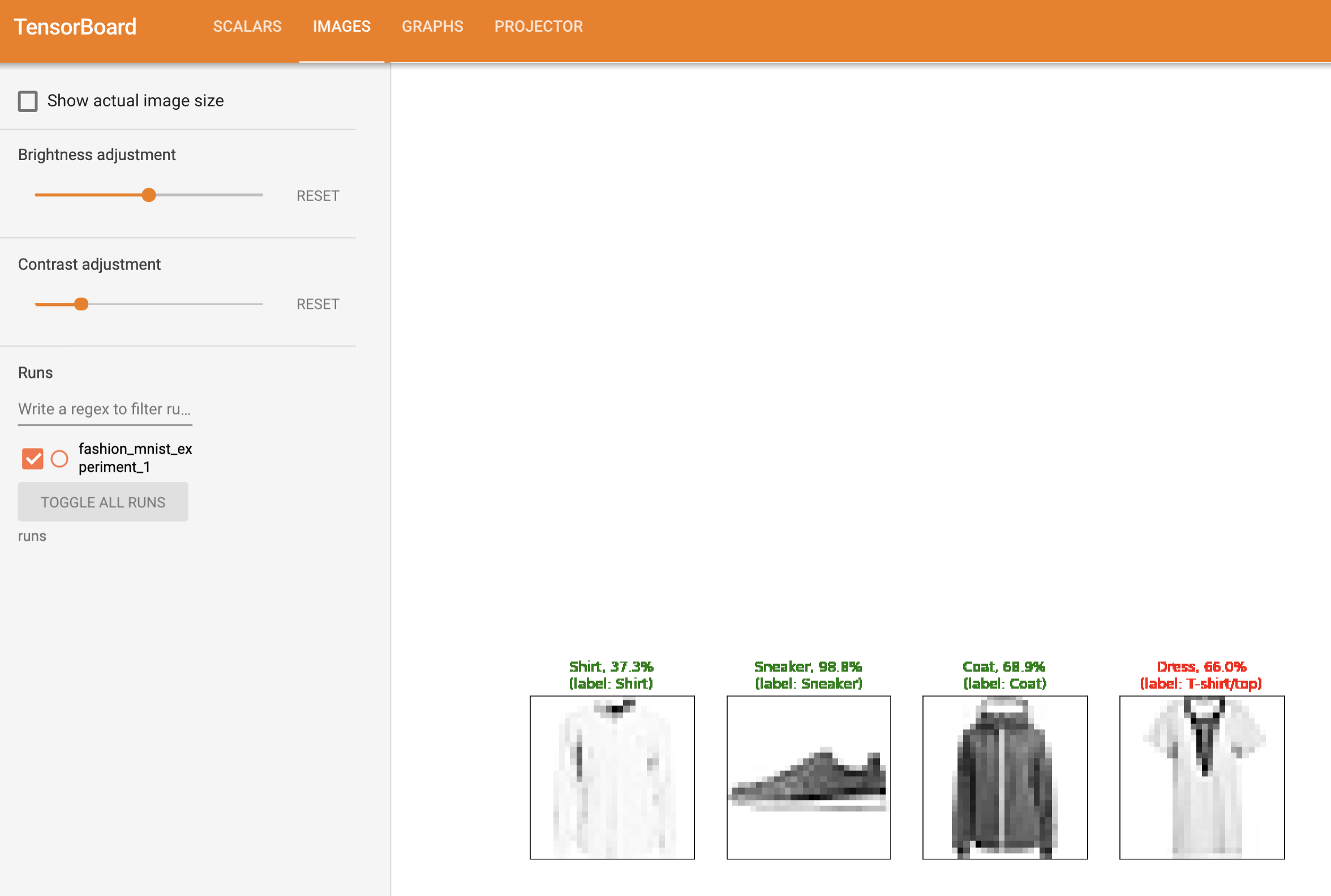
此外,在訓練過程中,我們將生成一張圖片,顯示模型在該批次包含的四張圖片上的預測與實際結果的對比。
running_loss = 0.0
for epoch in range(1):  # loop over the dataset multiple times

    for i, data in enumerate(trainloader, 0):

        # get the inputs; data is a list of [inputs, labels]
        inputs, labels = data

        # zero the parameter gradients
        optimizer.zero_grad()

        # forward + backward + optimize
        outputs = net(inputs)
        loss = criterion(outputs, labels)
        loss.backward()
        optimizer.step()

        running_loss += loss.item()
        if i % 1000 == 999:    # every 1000 mini-batches...

            # ...log the running loss
            writer.add_scalar('training loss',
                            running_loss / 1000,
                            epoch * len(trainloader) + i)

            # ...log a Matplotlib Figure showing the model's predictions on a
            # random mini-batch
            writer.add_figure('predictions vs. actuals',
                            plot_classes_preds(net, inputs, labels),
                            global_step=epoch * len(trainloader) + i)
            running_loss = 0.0
print('Finished Training')
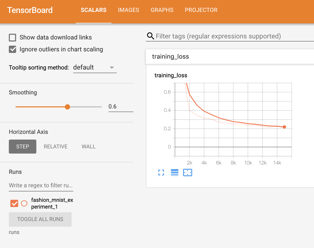
你現在可以檢視 scalars 標籤頁,看到在 15,000 次訓練迭代中繪製的執行損失曲線
此外,我們還可以檢視模型在整個學習過程中對任意批次所做的預測。檢視“Images”標籤頁,並在“predictions vs. actuals”視覺化下方向下滾動即可看到;這向我們展示了,例如,在僅僅 3000 次訓練迭代後,模型就已經能夠區分襯衫、運動鞋和大衣等視覺上不同的類別,儘管它的信心不如訓練後期那麼高。
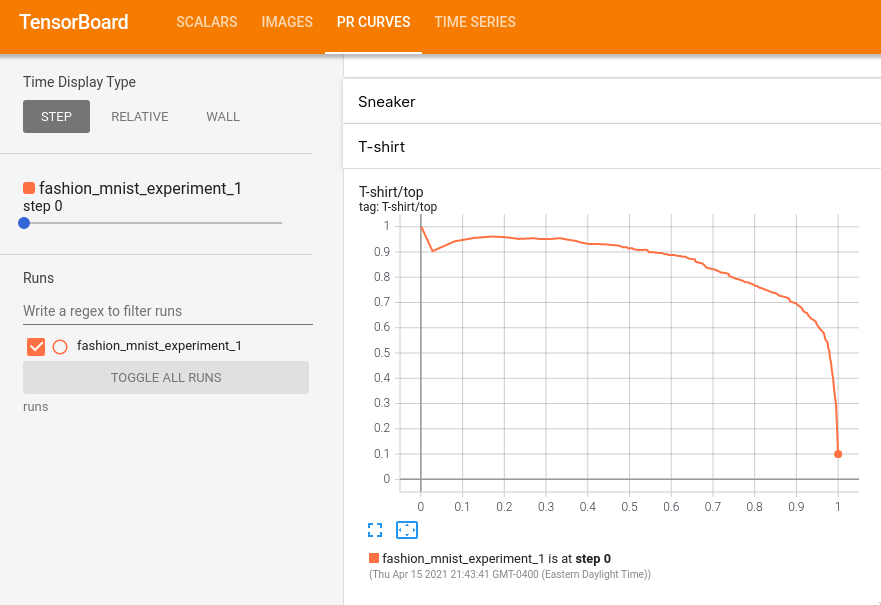
在之前的教程中,我們在模型訓練完成後查看了每個類別的準確率;在這裡,我們將使用 TensorBoard 繪製每個類別的 precision-recall curves (精確率-召回率曲線) (此處有很好的解釋 here)。
6. 使用 TensorBoard 評估訓練好的模型
# 1. gets the probability predictions in a test_size x num_classes Tensor
# 2. gets the preds in a test_size Tensor
# takes ~10 seconds to run
class_probs = []
class_label = []
with torch.no_grad():
    for data in testloader:
        images, labels = data
        output = net(images)
        class_probs_batch = [F.softmax(el, dim=0) for el in output]

        class_probs.append(class_probs_batch)
        class_label.append(labels)

test_probs = torch.cat([torch.stack(batch) for batch in class_probs])
test_label = torch.cat(class_label)

# helper function
def add_pr_curve_tensorboard(class_index, test_probs, test_label, global_step=0):
    '''
    Takes in a "class_index" from 0 to 9 and plots the corresponding
    precision-recall curve
    '''
    tensorboard_truth = test_label == class_index
    tensorboard_probs = test_probs[:, class_index]

    writer.add_pr_curve(classes[class_index],
                        tensorboard_truth,
                        tensorboard_probs,
                        global_step=global_step)
    writer.close()

# plot all the pr curves
for i in range(len(classes)):
    add_pr_curve_tensorboard(i, test_probs, test_label)
你現在將看到一個名為“PR Curves”的標籤頁,其中包含每個類別的精確率-召回率曲線。不妨檢視一下;你會發現,在某些類別上,模型的“曲線下面積”接近 100%,而在其他類別上則較低。
這就是 TensorBoard 以及 PyTorch 與其整合的介紹。當然,你可以在 Jupyter Notebook 中完成 TensorBoard 所做的所有事情,但使用 TensorBoard,你可以獲得預設情況下就是互動式的視覺化。
